Make your Public Homepage look good
We already talked about the importance of filling your tournament information.
This has become even more important, now that we’ve rolled out the dedicated tournament pages.
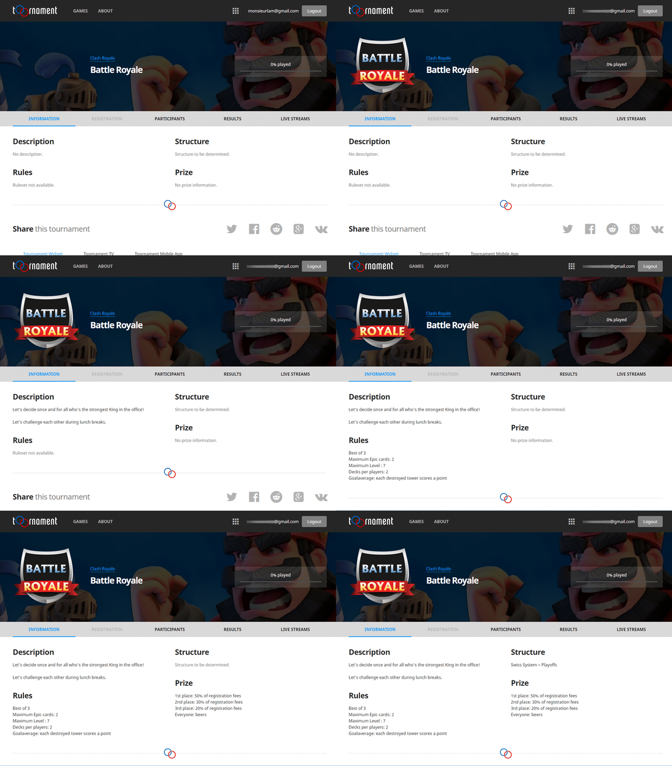
Check the differences between an "empty" tournament and a filled one:

Yep, muuuuch better.
Here are a few tips, to work on your homepage.
Logo
Think about your tournament logo, it really helps for brand awareness. We handle JPG and PNG (for transparency) files, starting from 512x512 pixels.
If your logo has a rectangular shape, we’ll crop it around it center point.
Description / Rules / Price
All three can be found in the "Settings" -> "General" section, under the "Details" tab. If you don’t have any detail to add, go for something funny !
Rules can be sometimes very long to read. If you want to avoid an awful-high page, just put the main ones and link to the detailed ones on your own site.
Structure
This part will update when you pick and generate your competition structure.
Now, go and give your tournament a nice showcase!

